SPC Chart & Calculation Options
With the data settings, the key settings used to display the SPC chart can be modified.
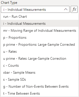
Chart Type
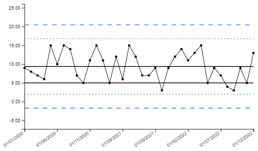
The SPC visual is set to individual measurements (i) charts by default, also known as XmR charts. There are other options available which use an assumed probability model to compute the 3-sigma limits. See the documentation on Chart Types for further details on each type.
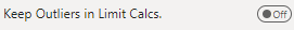
Keep Outliers in Limit Calcs.
Outliers are included in the SPC limit calculations by default, however this toggle allows the option of excluding these for any reason. With this option on, points that are outside three sigma are excluded from limit calculations for the i, p prime and u prime charts.
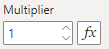
Multiplier
The multiplier affects the scale of the final value that is displayed in the SPC chart, with the default set to 1. This setting applies uniformly across all chart types, except for the p-chart which defaults to a multiplier of 100.
Decimals to Report
Sets the number of decimal places reported in the y-axis and tooltip. The number of decimal places in the y-axis can be overwritten by the Y-Axis Tick Settings.
Report as percentage
A drop down box to set whether the value should be reported as a percentage. This setting has three options:
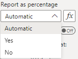
- When set to Automatic, the chart will report as percentage when a p or p prime chart type is selected, with a multiplier of 1 or 100.
- When set to Yes, the chart will always report as percentage.
- When set to No, the chart will not report as percentage.
The conditional formatting follows the same values as the drop down box.
Split Limits on Click
The split limits on click toggle allows users to click on multiple points in the SPC to recalculate the control limits for all the points before and including the clicked point, and all the points after the clicked point.
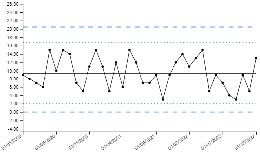
An example of this is below:
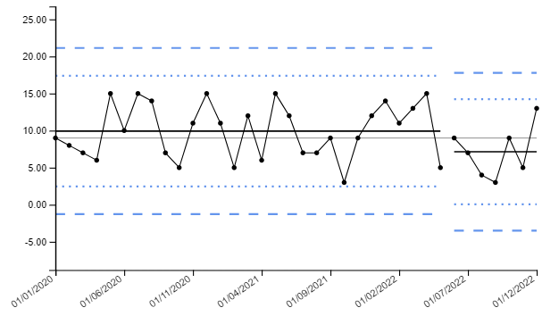
Developers are also able to toggle on the ability to split limits, set the location of your split limits, then toggle off the feature. This is useful when there is a clear process change and the limits need to be reset, but the functionality to split limits does not need to be carried into the published dashboard.
To reconcile the split limits, click on the same point that was initially clicked to split the limits (the last point in the limit series).
Truncate Lower and Upper Limits at
The lower and upper limits are able to be truncated using this setting, which sets a minimum and a maximum for the limits.
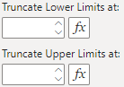
A use case for this would be in the example above for split limits, where the lower control limit is below 0 and into the negatives. Although theoretically possible using the i-chart probability model, practically this may not make sense for your measure if negative values are not possible. The lower control limit may be truncated to zero by setting this option:
Additional Target Value
By default, the SPC chart depicts a statistical centerline as set by the chart type. This allows for a comparison of how the process may be changing over time, relative to historical results. However, there are applications where a target value may be appropriate to include as well. This can be set using this option.
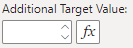
The example below sets an additional target line at 5. The line colour of the additional target line defaults to black, however this can be modified in Line Settings.