Scorecard/Summary Table Display
Rather than displaying a SPC chart for a single indicator or group, it is often desirable to display a summary of the calculations and outlier status for multiple groups/indicators. The SPC visual provides this grouped calculation/display, with full support for outlier detection (and NHS Iconography), conditional formatting for each group, as well as the usual cross-plot interactivity and highlighting.
Getting Started
Data Structure
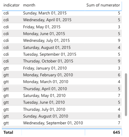
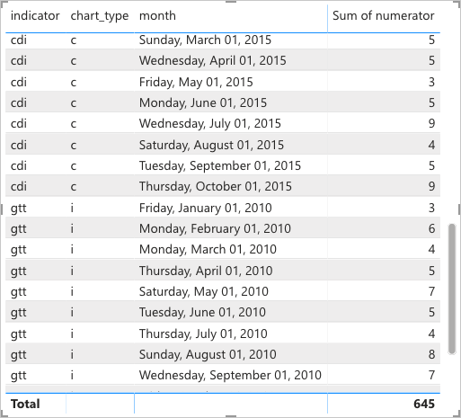
Consider a table of observations from two indicators, containing the following columns:
indicatormonthnumerator
Viewed as a table in PowerBI, this looks like:
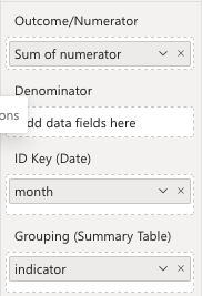
To create a summary table in the SPC visual, simply add the indicator column to the Grouping (Summary Table) field:
The visual will then automatically change to a Table view, displaying the results of the SPC calculations for each group:
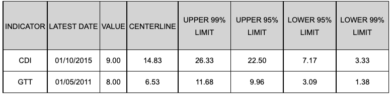
Table Columns
To add/remove columns from the table, simply use the existing settings for adding/removing plotted series in the SPC chart. The table will automatically update to reflect the changes.
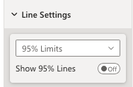
For example, to remove the 95% control limits from the table, simply switch off the Show 95% Lines setting under the Line Settings tab:
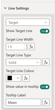
To change the names of particular columns, the existing Tooltip Label settings can be used. For example, the default name for the center line is Centerline, but this can be changed to Mean by changing the Tooltip Label setting:
NHS / Making Data Count Icons
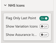
The same approach is used to add the NHS / Making Data Count icons to the table. Simply enable the Variation or Assurance icons under the existing NHS Icons tab:
The table will then automatically update to display the icons for each group:
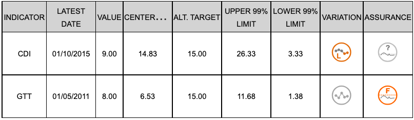
Table Aesthetics
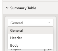
A number of settings are available to customise the appearance of the table, including font size, font colour, background colour, and more. These settings can be found under the Summary Table tab, with a separate section for each type of setting:
Conditional Formatting
As with the standard SPC visual, conditional formatting can be used to customise the calculation and rendering for each group.
For example, we might want to use a different chart type for each group. Given a column/measure with the desired chart type for each indicator:
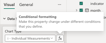
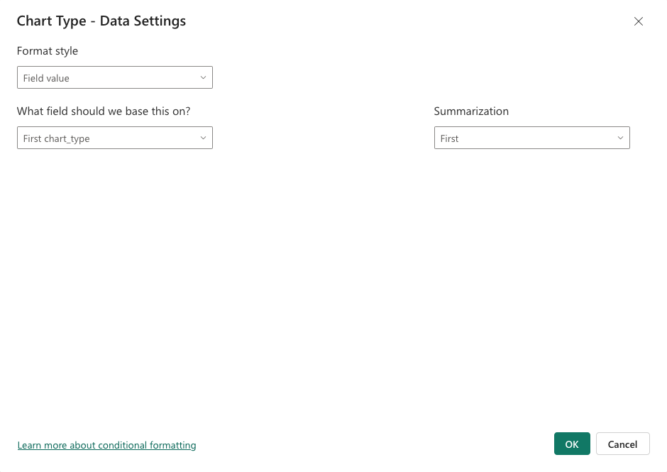
This can be provided to the Chart Type conditional formatting input:
The table will then automatically update to display the different chart types for each group. The same approach can be used for any other conditional formatting setting.