xbar: Sample Means
Where the i Chart is used for monitoring a single observation, the Xbar Chart is used for monitoring the average of multiple observations over time. The width of the chart’s control limits is determined by the number of observations and their standard deviation.
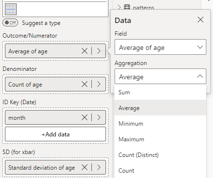
The Xbar chart to the left shows the monthly average age of patients over a 3-year period.
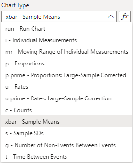
To construct this chart, you need to provide the mean, count, and standard deviation of your outcome in each time period. Thankfully, you can use PowerBI’s automatic aggregation to handle this for you. See the screenshot below for an example of this. Then, select the ‘xbar’ option from the ‘Data Settings’ dropdown.